Every part of Dentista: what it does, how it works, and where to find it. The teal boxes marked Where are the directions — if you only need to know where something lives, read those and skip the rest.
The Android app is laid out like the iPhone and iPad app, with the same three tabs and the same names. Where this guide says iPhone or iPad, the same goes for an Android phone or tablet; the few real differences are noted where they come up.
This is the reference. The FAQ is the shorter document for when something has gone wrong and you need to undo it — especially with money.
Every screenshot here uses invented patients. No real record appears on this site.
The whole app is three places: Appointments, Patients and Transactions. Everything else opens on top of one of them.
| Screen | What it answers |
|---|---|
| Appointments | Who is coming, and when |
| Patients | Everything about one person |
| Transactions | What has been done and charged, newest first, across all patients |
Your account lives behind the avatar button — your photo or initials. That panel is the way to Settings, to Lock Now when the app lock is switched on, and to Sign Out. It is also where this site lives: Guide opens this page and FAQ opens the shorter one.
Which of the two to reach for: the Guide when you want to know what a screen does, the FAQ when something in front of you does not add up — it is mostly about money, and it is the shorter read. Both open in a browser, so the app stays where you left it.
The Patients screen is a searchable list. Search
matches first name, last name and nickname, and it also matches phone
numbers — including the way a number is read aloud. A number stored as
+63 917 000 1234 is found by typing 0917 000 1234,
with or without the spaces.
New patients are added from the same screen. The editor asks for name, nickname, date of birth, sex, phone, address and — for a minor — a guardian. Only a name is required; everything else can be filled in later, and the record will say what is still missing rather than pretending it is complete.
Opening a patient gives you one long page rather than a set of tabs, because at the chair you are usually looking for one fact and scrolling is faster than remembering which tab it was on. In order, the record holds:
The alerts and the money are at the top and the contact details are near the bottom, which is the right way round for a record read at the chair: what could hurt the patient comes first, and the phone number is looked up at the desk.
Cards with nothing in them say so — None recorded, No treatments — rather than disappearing. An empty card and a missing card mean different things, and only one of them is honest.
Patient Intake is the first-visit form — the one a new patient fills in. It can be handed to them on the iPad, and it saves as it goes, so a form abandoned half-way is not lost.
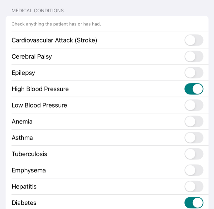
Medical History is the clinical questionnaire: conditions, allergies, medications, pregnancy, smoking. Anything answered here that affects treatment is lifted to the top of the record as a medical alert, in red. That is the whole point of the screen — the alerts are not a summary you have to go and read, they come to you.
Clinical Exam records the examination itself: soft tissue, occlusion, hygiene, the findings that are about the mouth rather than about one tooth.
The odontogram — the two arches of teeth. Each tooth can carry markings: what is wrong with it, what has been done to it, what is planned. Tap a tooth to open its markings, choose from the palette, and it is saved on the tooth.
The chart knows which dentition it is drawing. A child's record shows the primary teeth, an adult's the permanent ones, and a patient part-way through the change shows the mixed dentition — so the chart is never asking you to read adult teeth on a seven-year-old.
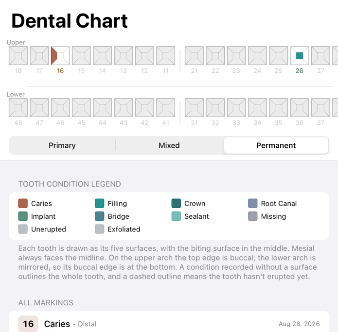
Where a tooth carries more markings than fit in the drawing, a small +1 badge appears on it. Open the tooth to see them all; nothing is hidden without being counted.
A treatment is one thing done to one patient on one day: the procedure, the teeth it applied to, the fee charged, the diagnosis, and who did it. The fee is pre-filled from the procedure catalogue and can be typed over — the catalogue holds the usual price, the treatment holds what was actually charged.
Each treatment row carries its own payment state, so you can see at a glance which piece of work is settled and which is not. A row marked Fully paid while the account still shows a balance is not a contradiction: the row is about that treatment, the total is about the whole account.
Progress Notes are the running clinical narrative for the patient, separate from any single treatment — what happened at the visit, in your words.
A prescription is built from the medicines catalogue, one or more lines, each with dose and instructions. It stays a Draft until issued; issuing it fixes it.
An issued prescription never changes. The medicine's details are copied onto the line at the moment it is issued, so editing the catalogue later cannot alter a prescription already handed to a patient. If one needs correcting, issue a replacement — the old one stays on the record and the new one is marked corrected copy. That is deliberate: a prescription that quietly changed after the fact would be worthless as a record.
The foot of the printed sheet is the signature block: the line you sign on, your name under it, and your PRC — and your PTR, if the clinic details carry one — under that. All three sit centred on the signature line, as one block. A draft prints the line empty for a pen; an issued prescription prints your saved signature on it, if you have one.
A dental certificate is the letter a patient asks for when school, work or an agency wants proof of a visit. It says the patient was examined, treated or both on a given date, and what for. It can add a recommendation, such as a day's rest, and say what the certificate is for.
You write only the visit. The name, age, sex, civil status and address come from the patient record and cannot be typed over, so the certificate never says something different from the record about who the patient is. If the record is missing any of them, the form says which ones before you print. The certificate leaves them out rather than printing a blank, and adding them to the record puts them in.
Under the visit, It will read shows the certificate's sentence as you type. From a treatment fills in the visit from a treatment already recorded, including the teeth, and everything it fills in can still be edited. Issued for offers School, Work or office, SSS or GSIS, Pre-employment and Other. Leave it on Not stated and the sentence about purpose is left out.
It works like a prescription. It stays a Draft until you choose Issue and Print. Preview shows the page first, marked DRAFT, and a draft cannot be printed or shared. Once issued, a certificate never changes: it keeps its own copy of the patient's details, so a correction to the record later does not rewrite a letter already handed over. To fix a mistake, open it and choose Issue a Corrected Copy. The corrected copy opens with everything filled in and today's date, and the list marks it corrected copy. Only a draft can be discarded.
The page is A4. Your name and address sit in a teal band at the top, and your signature, name, PRC and PTR sit on the left at the foot. An issued certificate prints your saved signature centred over your name; a draft leaves the space for a pen.
The Appointments screen shows a day at a time with a calendar to move between days, and a look-ahead section for what is coming up beyond today.
Each appointment has a status — scheduled, confirmed, completed, cancelled, no-show — and a provider it can be assigned to. Cancelled appointments stay on the day, dimmed, and are counted separately. A day that reads "3 booked" when one of the three is cancelled is a small lie told every morning, so the app does not tell it.
Recording a treatment is what charges the patient — there is no separate invoice step. Payments are then recorded against the thing they pay for: a treatment, or a payment plan. Where a treatment is financed by a plan the two are the same thing — Record Payment on either lands in one record, so a payment cannot be entered twice by going in the other way.
The account shows two figures, and they are usually different:
| Figure | Means |
|---|---|
| Balance | Everything outstanding, including plan instalments not yet due |
| Due now | What you can reasonably ask for today |
Due now is the figure to read out at the desk. A patient half-way through braces owes a great deal and owes almost none of it today; showing one number would be wrong either way.
Amounts group themselves as you type. Enter 1500000 and the field reads ₱1,500,000.00 — the separators appear under your fingers rather than when you leave the field, because a long figure is exactly the one worth checking before you commit it. Nobody miscounts 1500; everybody miscounts 1500000. Anything that cannot be part of an amount is ignored, so a stray letter does nothing rather than quietly leaving a form that will not save. On iPad the amount fields raise the ordinary docked keyboard opened on its number row, not the small floating keypad that used to detach itself and hover over the sheet.
Payments are never edited or deleted. A payment entered by mistake is corrected with a Reverse Payment, which writes an equal and opposite entry. Both stay on the record. The balance ends up right and the history says what actually happened, which is what a financial record is for. The FAQ covers this at length.
Three rules the database enforces, not just the app: only an administrator may reverse a payment, a payment can be reversed once — so two people reversing the same one at the same moment cannot both succeed and leave the patient in credit — and a reason is required. Payments are recorded in pesos as cash, GCash or bank transfer.
For work paid over months — orthodontics, mostly. A plan has a total, a schedule of instalments and their due dates. Instalments that have fallen due and are unpaid count towards Due now; ones still in the future do not.
A plan finances one treatment, and you pick that treatment first. The treatment's fee is the plan's total — there is no separate amount to type, and the Total row is shown but not editable. To change the agreed figure, change the fee on the treatment. This is why the plan can never quote a different number from the work it pays for, and why recording a payment on the treatment and recording it on the plan reach the same place: there is one payment record, not two. A treatment already carrying a plan cannot have its fee edited until the plan is cancelled, and it can carry only one active plan.
If a treatment has not been recorded yet, there is nothing to finance — record it with its cost first, then set the plan up from it.
The schedule can be entered from either end. Type how many instalments you want and the per-instalment amount fills itself in; type the amount you want each month and the number of instalments follows. The last instalment absorbs whatever the division leaves over, so the parts always sum exactly to the fee. A plan may run to 60 instalments — five years of monthly payments — and the form will say so rather than silently truncating if the amount you typed would need more.
Set down payment to half fills in half the fee in one tap, which is the usual orthodontic arrangement. Leave Down payment received today on if the patient is paying it now; switch it off and the plan correctly shows the down payment as overdue from the moment it is created.
The plan total is still derived rather than stored — down payment plus instalments — so the schedule and the agreed figure cannot drift apart. Payments attach to the plan rather than to a particular instalment, which is why a part payment or an early settlement needs no rules about which instalment it lands on.
Cancelling a plan stops future instalments falling due. The schedule and any payments already received stay on the record, and the patient's remaining balance is unaffected — cancelling a plan is not a way to write off what is owed, and the app will not let it be used as one.
A statement is the patient-facing summary of their account: what was charged, what was paid, what remains — dated, with a running balance and the full instalment schedule. The amount outstanding is set large at the top of the first page, so a patient asking "what do I still owe?" reads the number before anything else. A reversal appears on it too, beside the entry it corrects. Every page carries the clinic's PRC, PTR and TIN.
Where a patient is on a payment plan, the schedule starts on its own page. It is the half of the document they keep and check against next month, and below the totals it read as a footnote to them. Each instalment is marked Paid, Unpaid or Overdue — "unpaid" rather than "due", because on a page handed across the desk "due" reads as due now rather than due on the date beside it.
Under the schedule, one line says where the plan stands. Up to date, it counts what is left — "3 payments left (₱24,000.00) — next ₱8,000.00 due 4 Oct 2026", or "Final payment of ₱8,000.00 due 3 Nov 2026" when only one remains. A patient who has paid ahead is told so, and told which instalment their money has actually reached. Behind, the line turns red and leads with the arrears. The figure quoted is the real remaining balance, so half an instalment paid reads as the half still owed rather than the whole one.
The due dates never move. Paying early does not re-date the schedule and does not pull the final date in — the column is the agreement the patient signed, and a statement printed next month has to show them the same one. What changes is the line underneath, and the payment's own date, which is in the ledger on the first page where it belongs. Marking from the far end so an overpayment shortened the tail was tried and rejected: it prints a gap in the run of paid rows, names a date on which nothing is actually owed, and flips rows between Paid and Unpaid as the calendar advances with no money changing hands.
The statement opens as the finished PDF, exactly as it will print, with Share on it — AirDrop, Mail, Messages, Save to Files and Print are all on that sheet. Sending a patient their statement no longer means saving a file first and then finding it in another app.
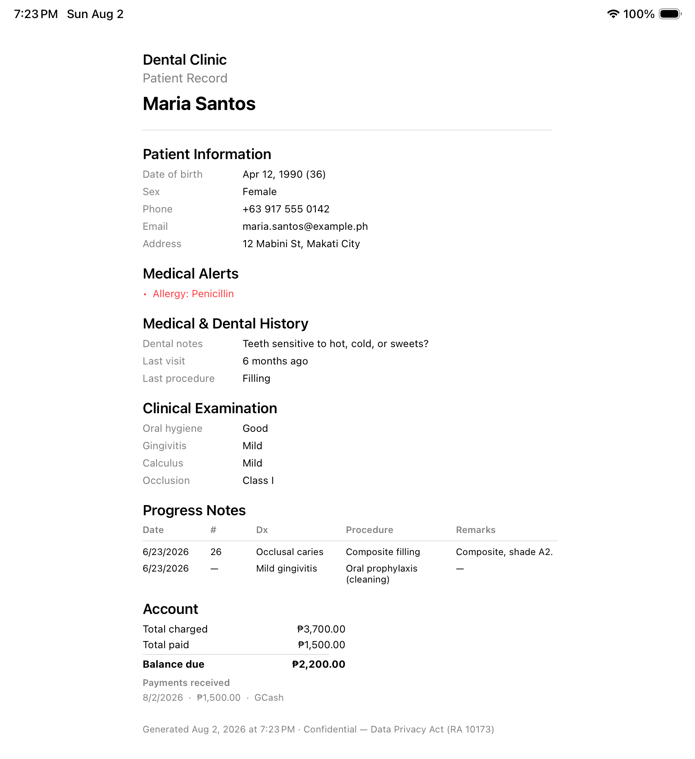
Export PDF on the record is the fuller document — the record itself rather than just the money. That one goes straight to the save panel rather than opening a preview, so it is saved and then sent; the statement is the one with sharing built into the page.
Two different things, deliberately kept apart:
Both are signed on the device with a finger or stylus, and the signature is stored with the consent. For a minor, the consent records who signed and their relationship to the child — a consent filed as the child's own when a guardian signed it is not a valid consent. The same holds when the intake form is handed to the patient: a minor is not offered "for myself", and the consent can't be accepted until the parent or guardian signing it is named.
A saved consent can't be edited or deleted, by anyone. A patient who withdraws is recorded as a new consent, dated, beside the one they gave, so the record shows both.
Two lists the clinic maintains, so that recording work is choosing from a list rather than typing the same thing every time.
Procedures hold a code, a name, a category and the usual fee. Medicines hold generic name, brand, strength, form and the usual instructions.
Entries are retired rather than deleted. A retired procedure still appears in the catalogue, marked and dimmed, because it is still the price that was charged on treatments already in the record — a catalogue that hid it could not explain them.
Clinic Information holds the practice name, dentist name, PRC licence number, address and phone — the details that appear on printed documents.
Staff is who has access. People join by requesting to, and an admin approves them; roles are set here. There is deliberately no account that can reach across clinics.
Reports summarises the practice over a period — what was done, what was charged, what was collected.
Audit Log answers "who looked at this patient's record, and when". It is filtered on the server by patient, action and period, and reading it is itself recorded. Admin-only.
Backups shows the state of the clinic's backups.
The app can lock itself behind Face ID, Touch ID or your device passcode (on Android, fingerprint or face unlock, or the screen lock), so records are not left on screen when you step away. You choose how long it waits — Never, or after 1, 5, 15 or 30 minutes — and it also locks the moment the screen locks or sleeps. On Mac the idle time is measured across the whole machine, so records stay up while you are working in another app.
If the device has no Face ID, Touch ID, fingerprint, face unlock or passcode set up, the lock is not available and Settings says so.
Handing the iPad to a patient — to fill in intake, or to sign a consent — ends by locking the app, so they cannot browse out of the form into the rest of the records. That requires biometrics to be switched on, because otherwise handing it over would be handing over everything.
Two separate things, both off unless you turn them on, and both about staff — patients are never notified, invited or messaged by Dentista.
Appointment reminders are on-device notifications before each upcoming appointment: 15 or 30 minutes, 1 or 2 hours, or a day ahead. Because a reminder appears on the lock screen, you choose whether it shows the patient's name or initials only — anyone who can see the screen sees whichever you picked.
Calendar writes the schedule into a calendar of its own, alongside your others. The same name-or-initials choice applies, and for a bigger reason: the calendar is created wherever your other calendars live, so if those sync to iCloud or another account, patient names go there too and appear on your other devices. On Android the calendar is made in your own Google account, so the names reach Google. Switching it off removes the entries again.
Changes are saved on the device the moment you tap Save, with or without a connection, and sent to the server on their own once there is one. Nothing waits on the network, and nothing is lost when the Wi-Fi drops mid-appointment.
Anything not yet sent is listed in Pending Changes, with what it is and how long it has been waiting. If the server refuses something, it appears there with the reason rather than vanishing.
A sandbox for practising in — training a new assistant, trying a workflow — without putting anything into the real record. While it is on, a bar sits across the screen reading Test mode · nothing here is saved, with a Leave button on it.
Leaving discards what you did. If you entered anything, the app names it and says the clinic's own records are untouched, then asks you to confirm with Leave and Delete. Nothing you do in test mode reaches the clinic's data, and nothing you do in it is kept.
A read-only view of the same records in a web browser, for machines the apps do not run on — the Windows PC beside the chair, most usefully. Sign in with the same Google account.
It installs like an app: on Windows or Android, Chrome or Edge offers to install it; on an iPhone or iPad, Safari's Add to Home Screen does the same. Installed, it opens in its own window with no browser chrome. It is the same read-only client either way — installing adds an icon, not abilities.
It reads; it does not write. There is no way to create or change a patient, treatment, appointment or payment from the browser. That is deliberate: writing at the chair is safe in the apps because of the save-first behaviour above, and a browser tab has none of that machinery.
It shows the day's schedule and the fortnight ahead, patient search and the full record including the drawn chart, outstanding accounts and plans in arrears, a printable statement, the reference tables and the audit trail.
It locks itself after 15 minutes idle, and what that means depends on an answer you give it under Settings → Reference → This device:
| Shared (default) | Mine | |
|---|---|---|
| At 15 minutes | signs out for real | covers the record, stays signed in |
| Coming back | through Google | one tap |
| Signs out at | 15 minutes | 60 minutes idle |
Leave it on Shared for any machine other people use — which is what the browser client is mostly for. Choose Mine only on a device of your own, and note what the lock screen tells you there: with the record merely covered, you are still signed in behind it.